In the ever-evolving world of graphic design and printing, consistency and accuracy are paramount. Whether you're designing a stunning poster, a sleek business card, or a captivating magazine spread, getting the colors just right is crucial. And for years, Pantone has been the go-to source for reliable color matching and communication in the industry.
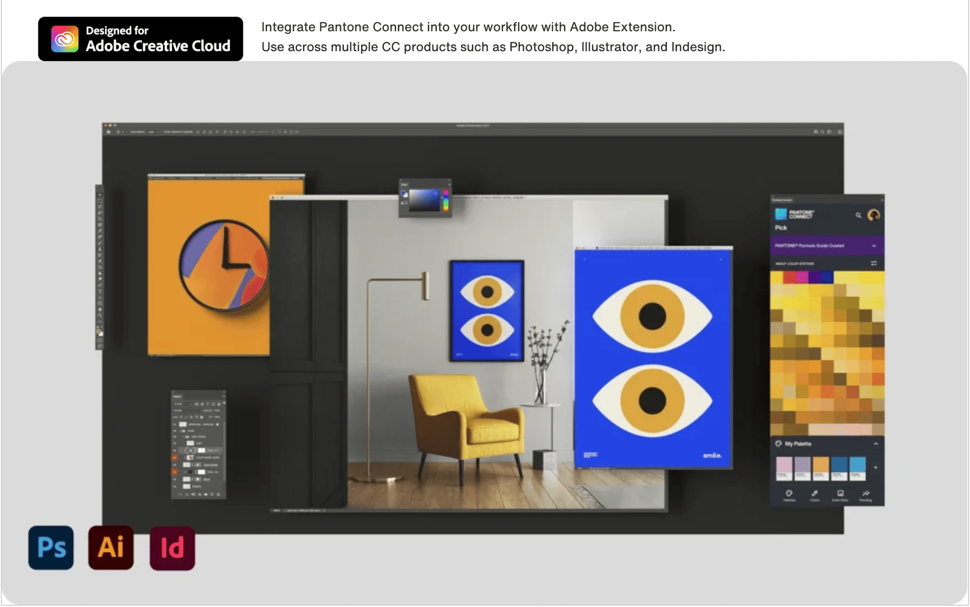
However, recent licensing changes have brought about a significant shift in the way designers can access Pantone colors within Adobe Creative Suite platforms. Pantone Connect for Adobe Creative Cloud is now the exclusive gateway to Pantone's color library, offering an array of tools to empower graphic designers to create stunning and accurate print-ready designs. Let's delve into why this development is essential for graphic designers in communicating with their print partners.
Image Credit: Pantone
Pantone Connect Basics: Free, Accessible, and Powerful
The first and most notable aspect of Pantone Connect for Adobe Creative Cloud is that it's accessible to all designers. The basic version of the service is free when you create an account, making it an invaluable resource for designers of all levels. Here's what the basic Pantone Connect subscription offers:
-
Access to 15,000+ Pantone Colors: Pantone is renowned for its comprehensive color palette, and with Pantone Connect, you get access to over 15,000 Pantone Colors, ensuring that you'll always find the perfect shade for your project.
-
Search, Pick, and Measure Tools: The platform provides you with the tools to search for the right color, pick it, and measure it precisely. This feature streamlines the color selection process, saving you time and effort.
-
Pantone Reference Numbers: Every color comes with a Pantone Reference Number, making it easy to communicate your color choices with precision, regardless of where you are in the design and printing process.
-
Save and Share Palettes: With Pantone Connect, you can save and share up to 10 palettes, allowing you to collaborate with colleagues and communicate your design vision effectively.
Consistency and Accuracy in Printing
The shift towards Pantone Connect for Adobe Creative Cloud is not just about ease of access; it's also about ensuring consistency and accuracy in your print projects. Here's why this is crucial for graphic designers when working with print partners:
-
Color Consistency: When you specify Pantone colors in your art files, you establish a universal language for your print partner to follow. This reduces the chances of color variation between what you see on your screen and what gets printed, which can be especially crucial for brand consistency.
-
Printing on Any Substrate: Pantone is a reliable standard across the printing industry. When you use Pantone colors, you can ensure that your design will look consistent on various substrates, whether it's paper, fabric, or any other material.
-
Eliminating Guesswork: By specifying Pantone colors, you remove the guesswork from the printing process. Your print partner will know exactly what colors to reproduce, reducing the likelihood of errors and the need for multiple proofs.
-
Efficient Communication: The use of Pantone Reference Numbers in Pantone Connect simplifies communication with your print partner. You can provide them with the precise information they need to achieve the desired results, fostering effective collaboration.
Seamless Integration with Adobe Creative Cloud
One of the most significant advantages of Pantone Connect for Adobe Creative Cloud is its integration with Adobe's suite of design tools. This means you can seamlessly incorporate Pantone colors into your design workflow. It simplifies the process of selecting, applying, and communicating colors with your print partner without leaving the applications you're already comfortable with.
In conclusion, Pantone Connect for Adobe Creative Cloud is the new standard for accessing Pantone colors, offering a free and accessible solution with powerful tools to aid graphic designers in achieving color consistency and accuracy in their print projects. When you specify Pantone colors in your designs, you provide your print partner with a clear and reliable reference, ensuring that your vision is faithfully realized in the final printed product. Embracing this change is not just a matter of convenience but a step towards elevating the quality of your print designs and strengthening your partnerships with print professionals.


